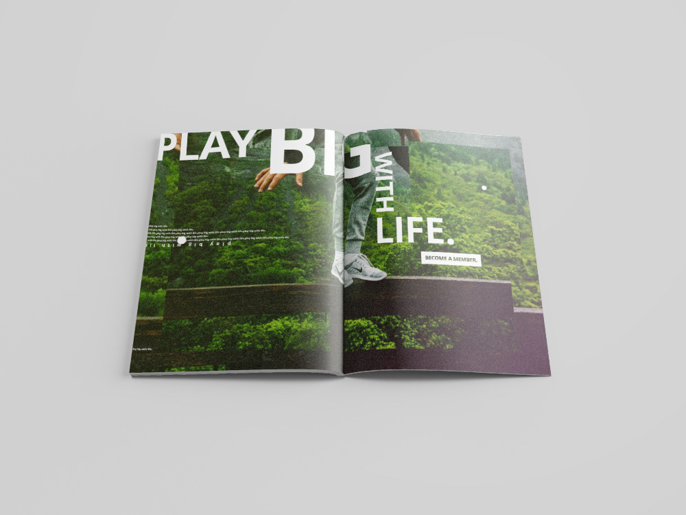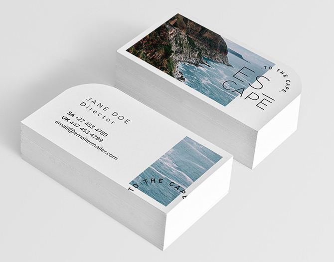
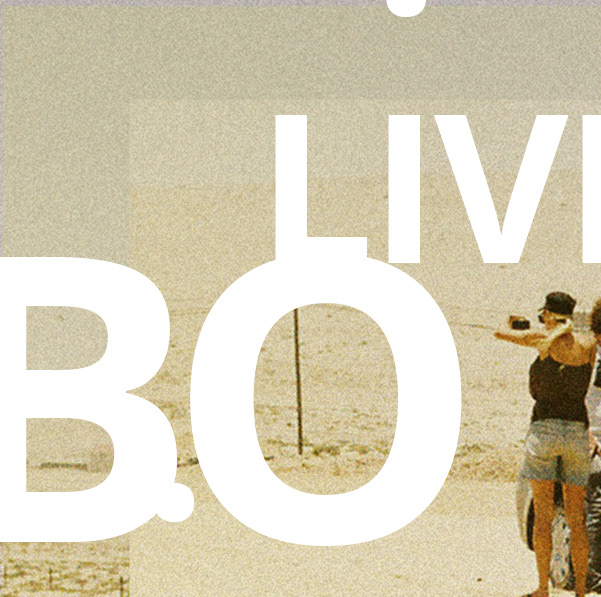
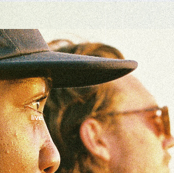
Photography by Adriaan Louw
Favourite details
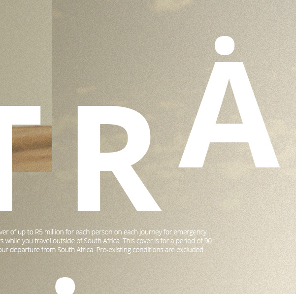
Favourite details
Favourite details
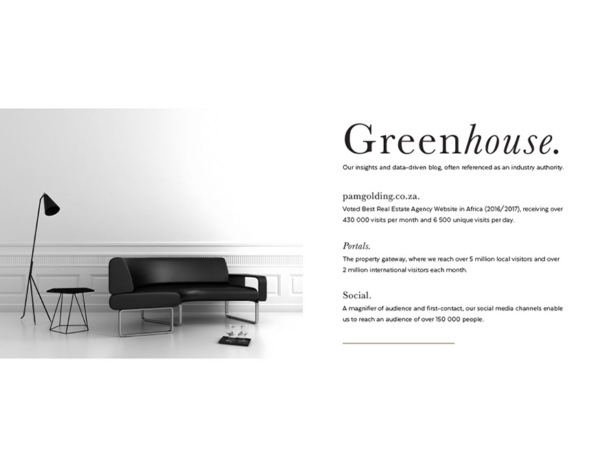
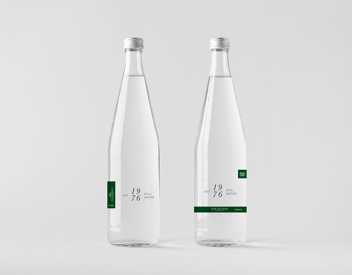
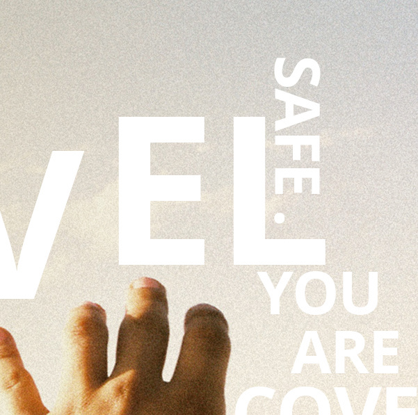
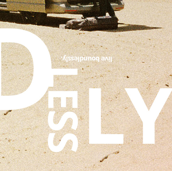
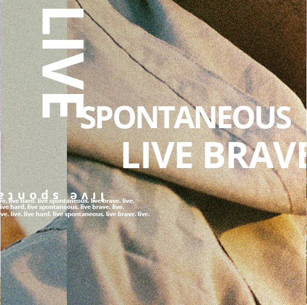
Photography by Adriaan Louw
Favourite details
Favourite details
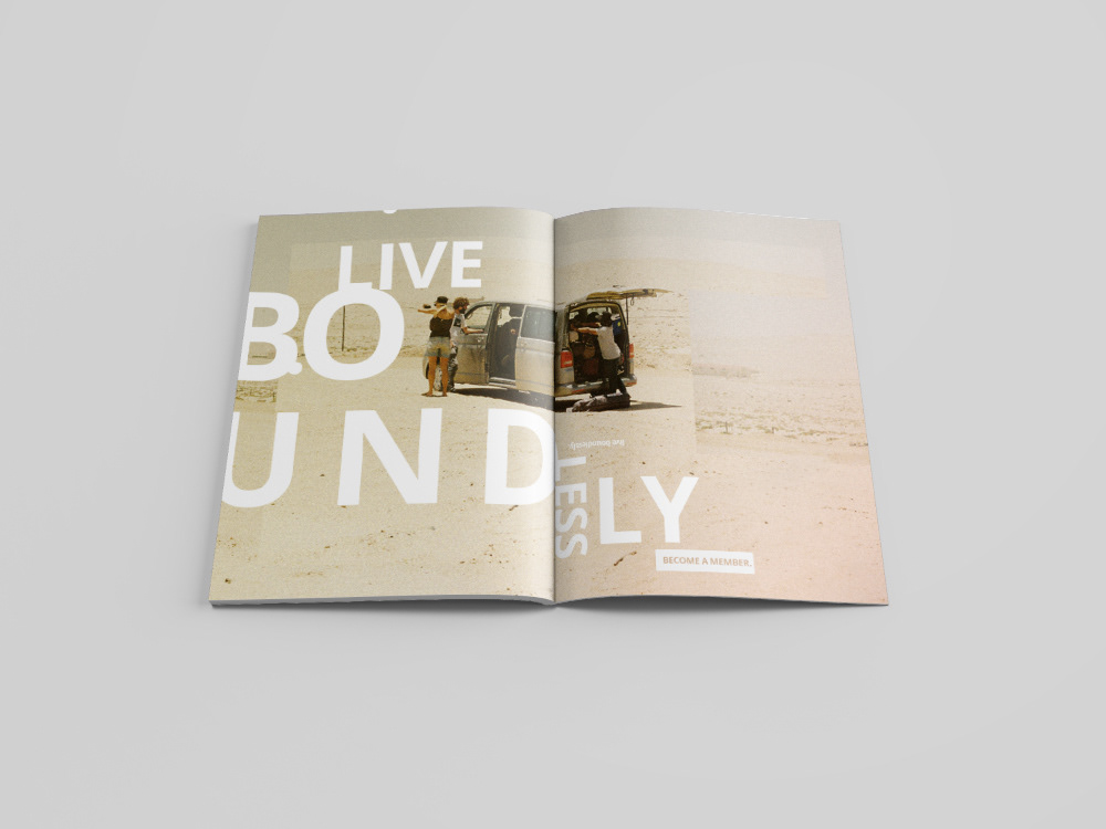
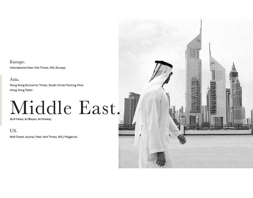
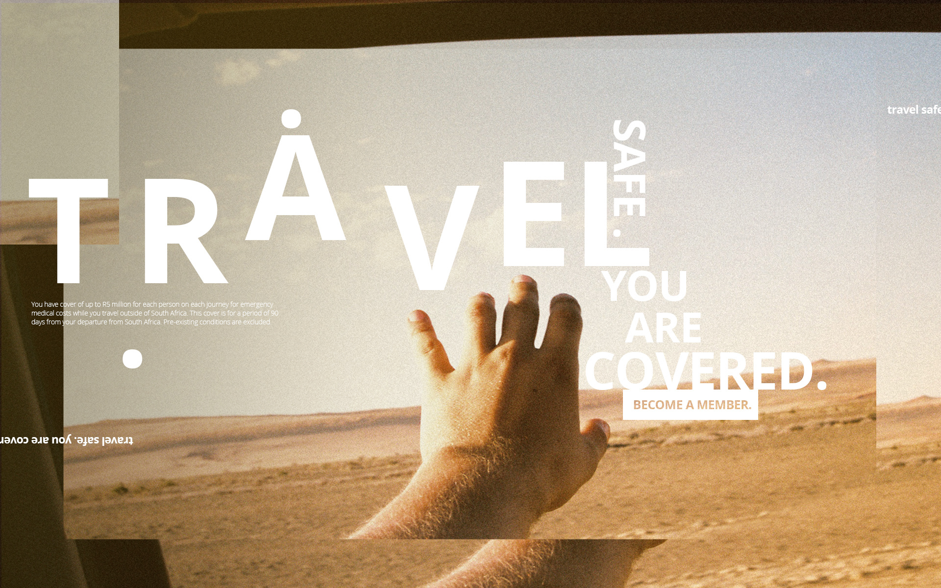
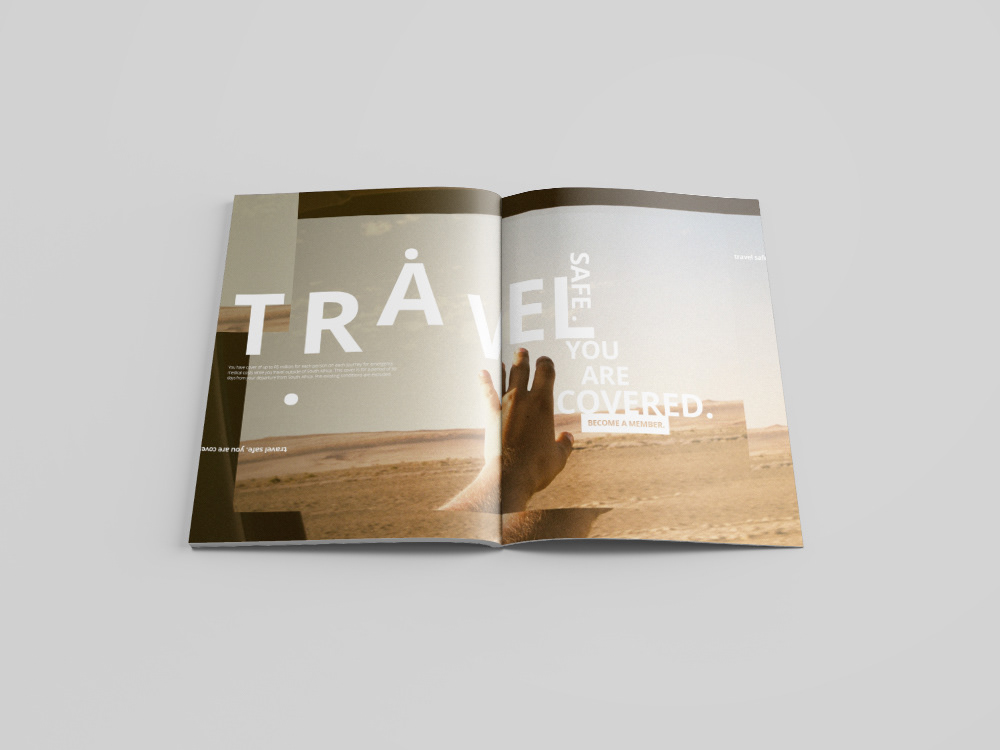
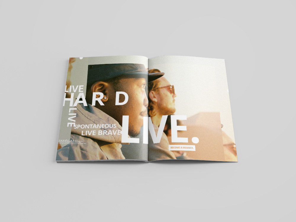
Photography by Adriaan Louw
Favourite details
Favourite details

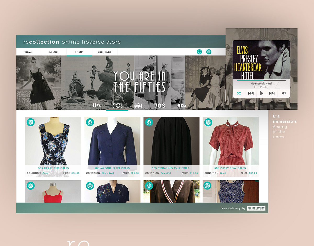
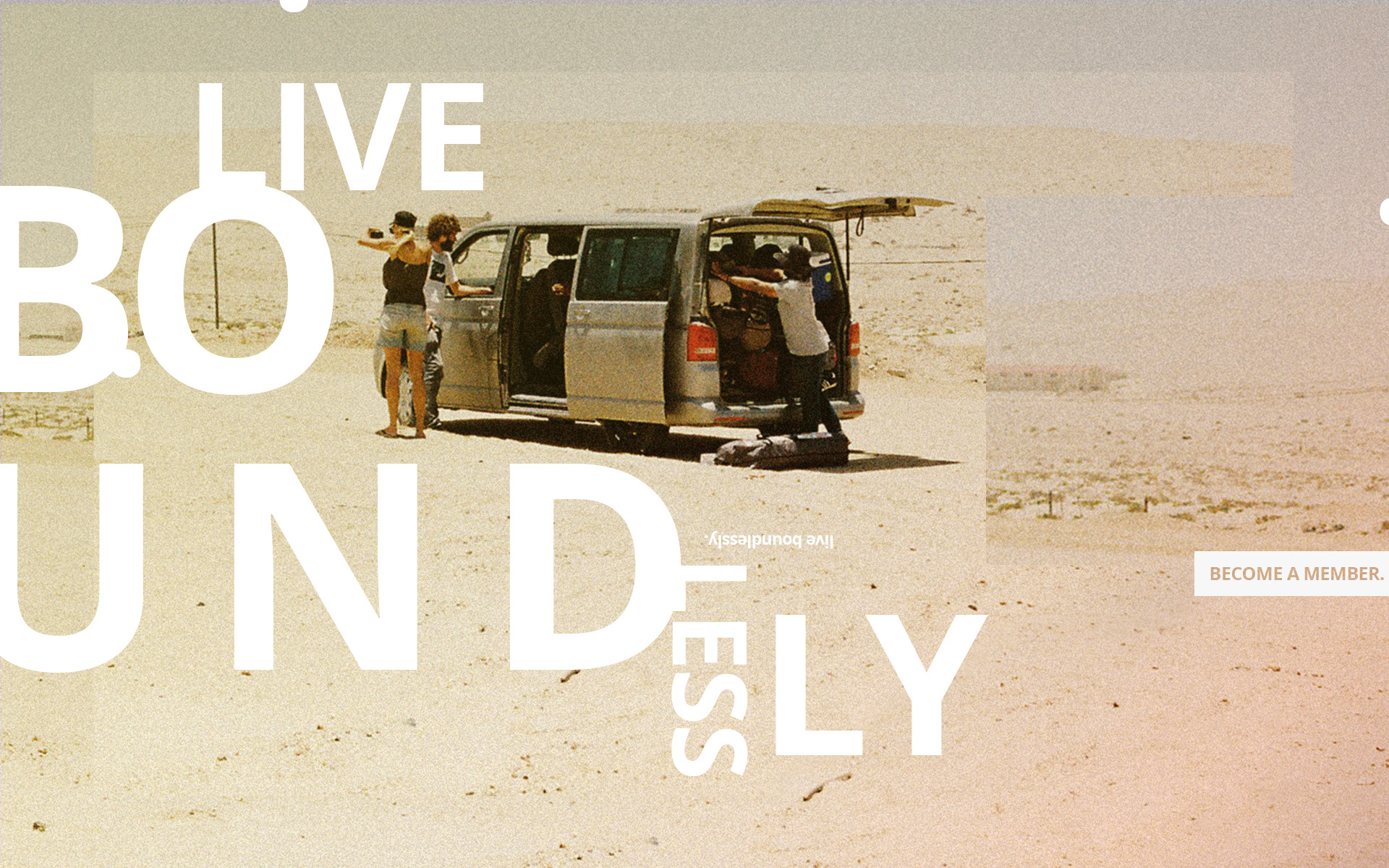
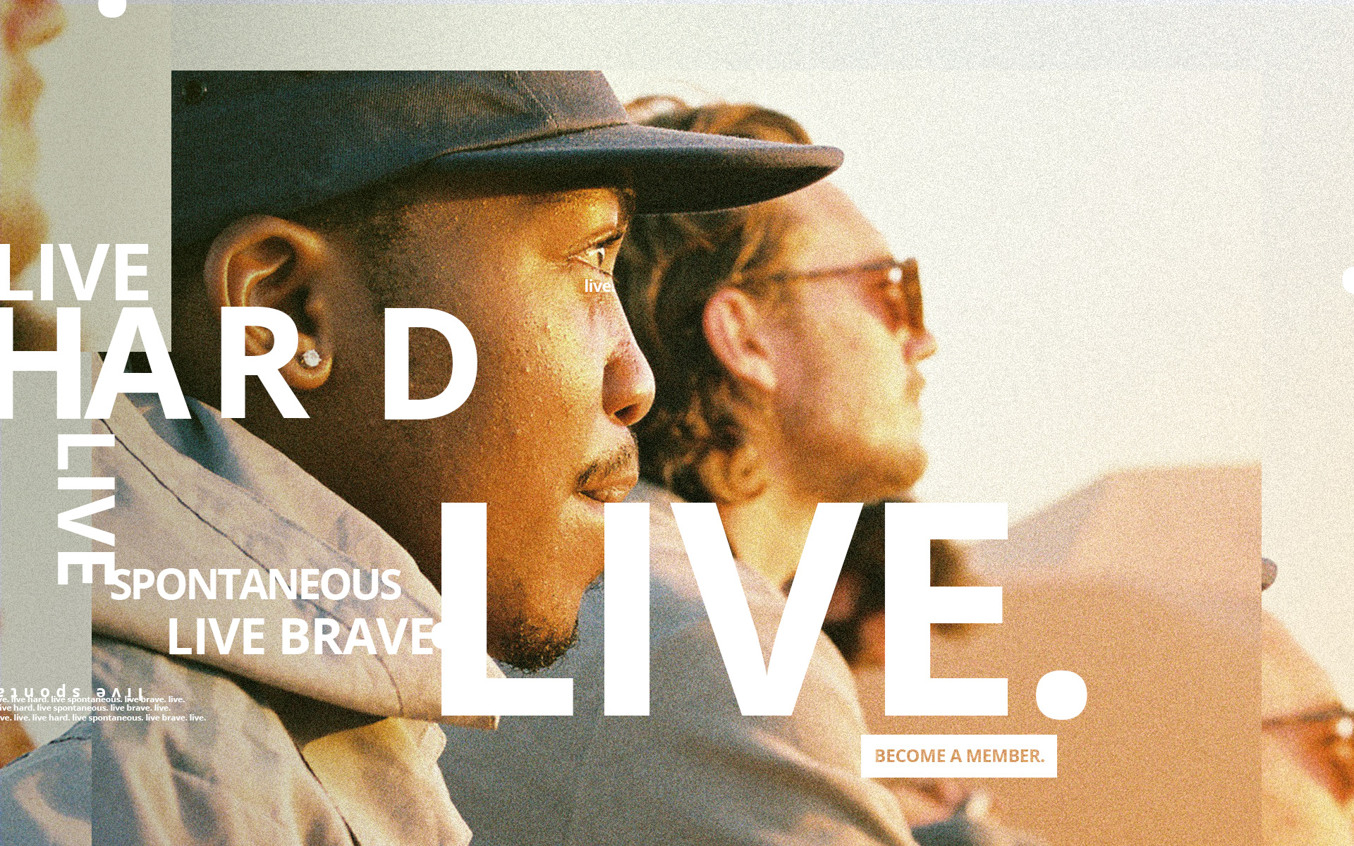
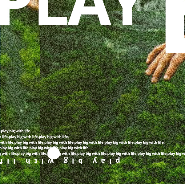
Photography by Bossfight.co
Favourite details
Favourite details